Introduction
According to the World Health Organization, there are at least 2.2 billion people globally that have either a near or distance vision impairment. In at least 1 billion, the vision impairment was either preventable or unaddressed. The World Health Organization defines “low vision” as visual acuity between 20/70 and 20/400, with the best possible correction, or a visual field of 20 degrees or less. “Blindness” is defined as a visual acuity worse than 20/400, with the best possible correction, or a visual field of 10 degrees or less. It may be common to think of visual impairments solely in terms of who can see and who can’t see but visual impairment extends beyond that and includes sensitivities to brightness and darkness as well as colorblindness.
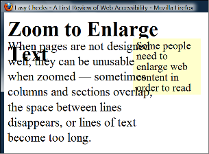
Visual impairment can make navigating user interfaces extremely difficult. While technologies such as screen readers exist, the program, hardware, software, or product may still suffer from accessibility pitfalls. For example, one interviewee for the project discussed how often times accessibility settings and help pages are not designed for people who experienced recent significant vision loss but rather those who have experienced it and are accustomed to it. As such, there is little help for users who are not familiar with the tools. Additionally while the ability to customize UI may exist, such as the ability to zoom in on a webpage, it may be implemented in a way that is confusing or makes the page illegible (see image below).
Based on my interviews with industry professionals and those with visual impairments, these are the accessibility best practices to assist with these impairments. At the bottom of the page, you will also find the checklist for visual accessibility.
Text
When we think about textual elements for visual impairments, it is not only the appearance of the text that we should focus on but also on how the text is presented to the user. For more clarity, how the text is read visually is only one component but also its comprehensibility. One contributor to the website pointed out that with screen readers, ambiguity or duplicate setting features can lead to frustration, which makes the user not want to access your product. With that in mind, it is important to consider what you want the text to convey along with how it looks specifically for visual impairments. Let’s first examine the actual appearance of the text.
For the text appearance, think about the size, font, weight, style, and color.
For size, don’t think in terms of “Bigger means better”: that may ring true for some visual impairments but not others. People with tunnel vision may actually prefer smaller fonts to see more information at once. To help, consider allowing the user to change the size of the text or allow the product to dynamically change the size of the font when zoomed in. For physical media, consider having a large text version especially when it comes to menus, terms and services, and manuals.
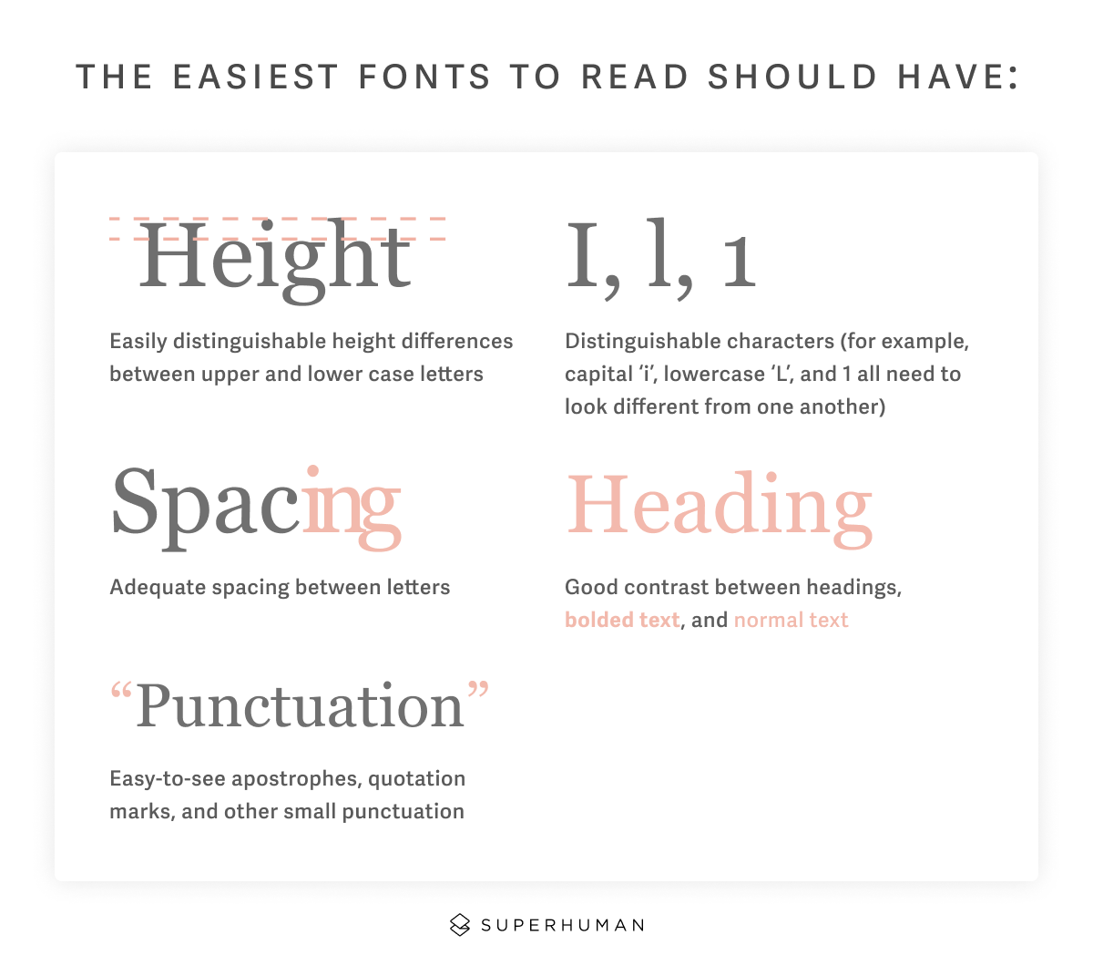
Font and weight are dependent on each other. Some fonts may be harder to read because they only support one font weight or individual letters are simply hard-to-read. Some weights may be too thin and blend in with the background. Fonts also need to have characters that are distinguishable from one another. Usually this means serif or sans serif fonts.
Finally, color contrast can make or break the legibility of text. The WCAG AA guidelines states that large text MUST have a contrast of 3:1 at the bare minimum and regular text a contrast of 4.5:1. There are many checkers on the internet that allow this, but a good rule of thumb to keep in mind is that if a regular user can barely see it, a visually impaired user will definitely be unable to see it.
If these options are not built into to the text, WCAG requires that content can be magnified up to 200% without truncating, breaking, or obscuring elements on the screen. If possible, it’s ideal not to assign specific font sizes but rather a font size percentage so that it scales with the magnification.
It’s also important that text content conveys exactly what you want it to semantically avoiding duplicates or ambiguity. For example, don’t have two settings named “Brightness” if they apply to different settings. Make sure that the text can be understood without a visual using clear, plain language. Semantic markup is especially important as well. Make sure content is labeled in the html or at least visually that makes content is easy to follow and differentiated by screen readers.
Images
Alt text or alternative text provides a screen reader with context to a visual element on the screen. Usually this means images, infographics, or any other static graphical element. What is important to know with alt text is that not ALL images require alt text, but specific types of images do. The Web Accessibility Initiative divides images into 3 categories: decorative, informative, and functional images. A decorative image is used as part of page design, ambience, or as a part of a text link. An informative image is used to label other information (such as a phone number or email address), supplement other information, conveys succinct information, convey an impression or emotion, or convey a file format. A functional image is used to initiate actions rather than to convey information such as a button, link, clickable logo, etc. Informative and functional images almost always require alt text. The normal format for alt text is less than 140 characters per description which is where the screen reader will stop reading. If longer formats are needed, consider using the longdesc tag.
If the image is complex, it may be necessary to add text after or before that explains the image. This is especially important for tables, graphs, and charts since screen readers will not be able to read the text from the image. Logos or symbols used will need appropriate alt tags
Audio Description
Audio description allows the visually impaired to access video content. According the American Council for the Blind, Audio Description should adhere to the following tone and style guides:
Language:
- Write simply, clearly and concisely so that the description is easy to comprehend.
- Use descriptive, accurate and appropriate language.
- Use complete sentences wherever possible, unless simply identifying a character.
- Match your vocabulary to the content.
- Avoid technical terms unless absolutely necessary.
- Beware of using he, or she, when this can be misleading.
- Do not use offensive or racist terms, (but do describe ethnicity where relevant), however, do not censor what you see.
- Work on expanding your vocabulary, especially verbs!
- Avoid the term “we see.”
- Be aware of what is real and what is illusion for your listeners.
Style/Tone:
- Never override the dialogue unless it is absolutely necessary. If you have to talk over the actors then do so over the least consequential dialogue.
- Describe what you see without interpretation or personal comment.
- Match your style, tone and pace to the show, scene or event you are describing or in other words, harmonize your delivery with the content of the presentation.
- Sound confident, interested, warm and authoritative. Be sensitive to the mood of the scene. Do not be patronising or chummy.
- Do not be tempted to fill every pause.
- Employ good microphone technique — no extraneous rustles, bumping the mic, varying your distance from the microphone, sudden unnecessary changes in volume etc.
- Describe at the same time as the action unfolds, or anticipate slightly, particularly with regard to comic or horrific situations to enable your listeners to experience the same emotions as the sighted audience at the same time.
- Describe in the present tense.
- Good description directs attention to the presentation, not to itself
Additionally, audio description has 5 quality standards.
- Accurate: There must be no errors in word selection, pronunciation, diction, or enunciation.
- Prioritized: Content essential to the intended learning and enjoyment outcomes is of primary importance.
- Consistent: Both the description content and the voicing should match the style, tone, and pace of the program.
- Appropriate: Consider the intended audience, be objective, and seek simplicity and succinctness.
- Equal: Equal access requires that the meaning and intention of the program be conveyed.
It’s also important to consider captions for those with low vision but who are not completely blind: just remember that that the captions will need to be customizable for ease-of-access.
UI/UX
This section specifically deals with UI/UX considerations for apps, websites, and video games.
While it may seem obvious, it’s important that any website, game, or app is able to be read by a screen reader or have text to speech options for on-screen navigation. This way the user knows what they’re clicking on and what it does. Another important consideration for navigation is two-fold: alternative input methods and voice recognition. The former allows the user to choose whether they can navigate via controller, or keyboard only. Mouse navigation can be hard for those with limited fields of vision or with speech reader technology. The same goes for motion controls especially when the user cannot see where they are pointing or aiming. Voice recognition is important for ease-of-access. A user can easily tell the software where it wants to go, or instead of typing, dictate what they’d like to write or search. Different input methods are extremely useful for visual impairments.
Color contrast is especially important when the app has a default color palette or visual appearance. Contrast between UI elements increases visibility and more importantly, having the option of how the contrast should look avoids frustration and the risk of your content being inaccessible.
It is vital for any sort of focus cue (objectives, enemies, notifications, and errors) to be both visual AND auditory or have the option to make it non-visual. Much of visual media uses focus cues to grab the users attention that are, for the most part, visual only. Having something simple such as a notification sound or haptic feedback on the controller avoids this issue entirely. It can even allow a player to beat a game while completely blind.
Physical Media
For any form of physical media, it is necessary to have a large-text and a braille version. Visual impairment is not just people who are completely blind: something as simple as needing reading glasses is considered visual impairment. Large-text versions of menus, documents, terms and policies, or forms present the consumer with accessible options and can be especially helpful for full width languages like Korean.
Of course, this wouldn’t be an accessibility article without mentioning braille. Braille versions of documents and signage are vital to those who are completely blind and with low-vision. Just make sure your Braille is actually tactile.