Before we begin, please note that while this is labeled as “Cognitive Accessibility Considerations”, some of the material presented can fall under neurological disability as well. I grouped them together because of how interconnected they were in their considerations and because they sometimes share comorbidities with one another.
For the sake of this article, cognitive disabilities refer to intellectual disability, autism spectrum disorders, severe, persistent mental illness, brain injury, stroke, and Alzheimer’s disease and other dementias as stated by the Federal Communications Commission, learning disabilities (such as dyscalculia, dyslexia), attention disorders like ADHD, and other neurological disorders specifically epilepsy. According to the CDC around 12.8% of Americans have some sort of cognition impairment. For global numbers, the number changes depending on which specific disability but here are a few numbers:
- About 15% of the population has a learning disability (https://www.thetreetop.com/statistics/learning-disabilities-statistics)
- More than 50 million people worldwide have epilepsy (https://www.ncbi.nlm.nih.gov/pmc/articles/PMC9977758/)
- Around 2.58% of adults and 5% of children worldwide have ADHD (https://www.ncbi.nlm.nih.gov/pmc/articles/PMC7916320/)
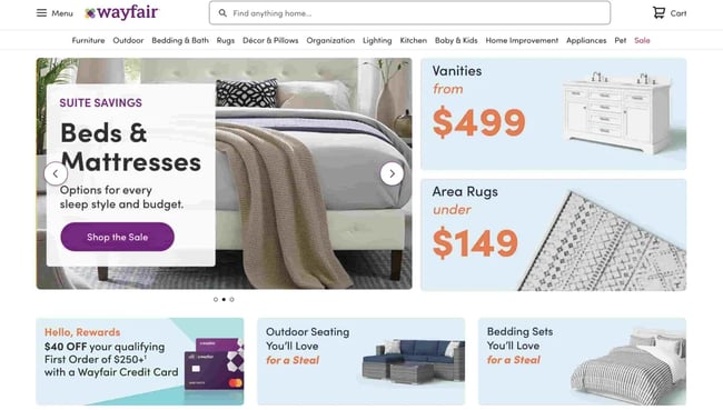
For the most part, accessibility for these types of disability deal with the way content is displayed both visually and semantically. That means that content needs to fit visual requirements but also needs to be easily understood by all. A crowded webpage may be helpful to show a lot of information at once, but for someone who has trouble focusing, they can’t navigate your website as intended. For example, a lack of visual hierarchy can make users confused on where to click or go as seen with this example of wayfair.com seen in HubSpot’s article “19 Examples of Bad Website Design in 2022 [+ What They Got Wrong]”:
Based on my interviews with industry professionals and those with cognitive impairments, these are the accessibility best practices to assist with these impairments. At the bottom of the page, you will also find the checklist for cognitive accessibility.
Content Display
The most important accessibility need with cognitive disabilities is how content is displayed. For people with cognitive disabilities, content can be hard-to-follow, unintelligible, or overwhelming depending on how it’s displayed to the user. Not only that but it can also be hard to understand at the semantic level with too many technical terms thrown into the content without definitions or the content itself is far too detailed for a layman to read. A good way to avoid this is trying to explain your content to someone with no knowledge of your subject. If with no prior information, they can’t understand your content, how can you expect your user to do the same? With this in mind, we’ll first go over visual display of content and then the semantic display of content.
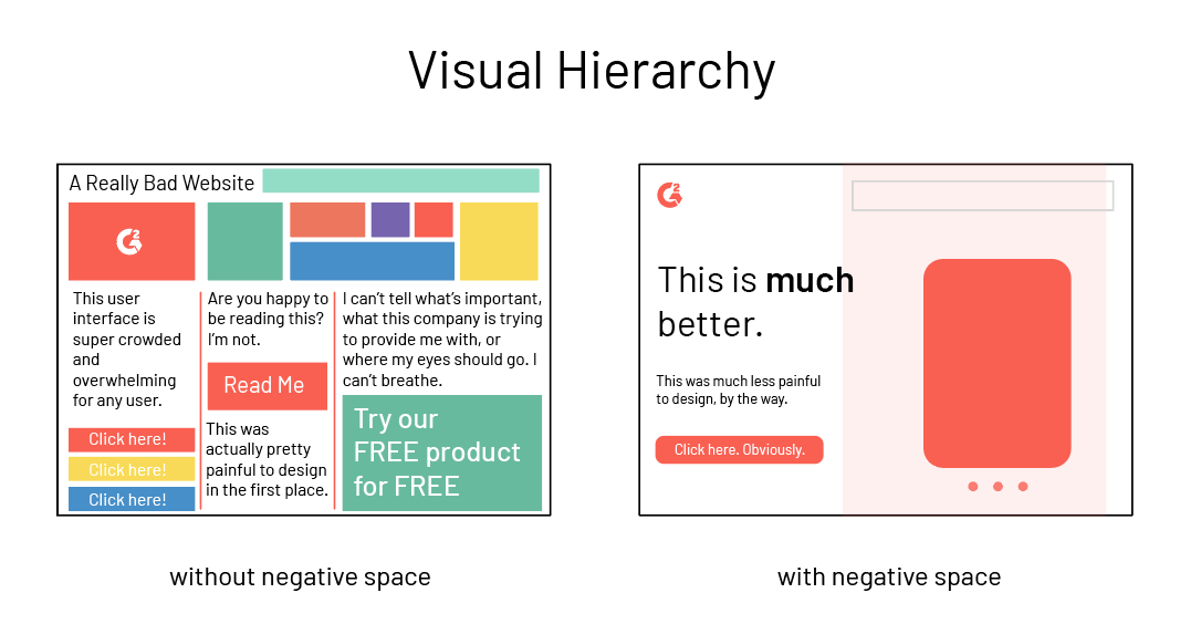
All content should follow what is called a visual hierarchy. Similar to what is mentioned in the visual accessibility considerations, a visual hierarchy means that there is clear labeling and distinctions between types of content. This means headings, body content, captions, and any other elements that appear to the user are clear and legible. Without a visual hierarchy, content can be hard to follow and look less streamlined which makes the user want to leave rather than try to navigate the webpage. This same concept applies to the divide between content groups. For example, there should be clear separation of text from an image, paragraph to paragraph, page top from page bottom, and etc. If your webpage looks like one big blob of text, it will be hard for people with cognitive disabilities to access your content. Fields should also have clear labels to tell the user what a fillable field is for and what they have to put in it.
Aside from how the content is spaced, visually, the content should avoid flashing, strobing, or light effects. These effects, while eye-catching, can cause serious problems for certain users. Users with photosensitive epilepsy can have their seizures triggered as well as users suffering from migraines. Now instead of just causing the user frustration, the user has a serious medical issue to deal with. On a less grave note, these effects can also distract users which is extremely disorienting to those with attention disorders and learning disabilities. If possible, these effects should not be used, have the option to be disabled, or, if neither aforementioned option is available, there should be a warning to the user. The same approach should be given to animations and other visual content like videos.
Another consideration is how content updates. Content that updates automatically can lead to frustration especially to users that need more time to read or digest on-screen content. If the content updates before the user is ready, they can lose their place and as a result, leave your content. Letting users control when content updates, when it moves, and how they see it makes it more accessible for all, especially when you consider different browsing speeds.
Finally, for visual considerations, consider using serif and sans-serif fonts. These fonts are the best for readability and are less likely to get switched around for users with dyslexia.
As for semantic display, make sure that your content is written in clear simple language when possible. Low-literacy levels in locales as well as translation benefits from language that is easily understood by everyone and cognitive disabilities benefit greatly from language that gets straight to the point. If simple language is not an option, make sure there are glossaries and definitions for your technical and proprietary terms. Sure, a user can look up these definitions themselves, but it’s possible to lose the contextual meaning and users won’t understand what you intend to convey. Having your own definition for these terms readily available keeps the user on your content, not searching for another content.
For links, make sure they describe to the user what they are going to do. For example, links should have text that says “Click Here”, “Read More”, “Go to”, and other descriptive titles to cue to the user what their purposes are. Otherwise, the user may not navigate the way you’d like them to. Similarly, to remove ambiguity of a label or text, consider adding a relevant logo to cue to the user what the content is about or what it is related to.
UI/UX Considerations
For video games, apps, and websites, there needs to be a balance between cognitive overload and simplification. Too much on the screen can overwhelm the user as mentioned before, but too little may make it harder for the user to understand what’s going on. One way to avoid this is having customizable UI or HUD options. The user can choose what is displayed, how its displayed, and how much help they get from the UI. For video games, some users may need only the relevant tasks for the quest they’re currently on, or maybe only want to see specific locations on the map like stores, quest markers, landmarks, etc. Giving the user the option lets them have control over what the need, rather than having someone else assume what they need.
Tasks and objectives should be descriptive and clear to avoid ambiguity of what the users needs to do especially on forms and in video games. That means it should clearly state what to do and how to do it. If time sensitive, it should also state when it needs to be completed. It should also be noted that task and objective reminders are helpful to keep the user focused especially in the case of attention disorders. Finally, timeouts for the screen should either be disabled or able to be lengthened to account for different focus times and allow for more reading time.
In that same vein, there should be help text whenever available in settings, menu, and option screens so that the user knows exactly what they’re changing, how it changes, and why. Having ambiguous titles or settings can confuse the user and disrupt their overall experience. You can avoid this by using plain simple language in titles and setting descriptions along with help text. See the image below.

It should be noted that navigation between screens and menus should stay consistent. If there are too many differences, it can be hard to find vital information and the user can become confused, frustrated, and unable to experience the product effectively. Implementing a site map or a search functionality can help the user find information easily if navigation needs to be different between menus or even if it is consistent. A site map easily displays all important locations to the user in one place so they don’t have to navigate through tons of content to find it. A search feature lets the user tell you what they want rather than make them find it themselves. The search functionality should account for spelling errors where possible.
Similar to the HUD and UI, the users should be able to change focus cues to their preference. For people with auditory processing issues, audio heavy content that then have audio focus cues can make it hard for them to experience. Similarly, too much haptic feedback or visual cues can be overstimulating to users with sensory processing issues. Allowing the user to disable some of these settings or completely customize it aids greatly in their experience. Motion blur is also something that should be or can be disabled as it can cause disorientation in users with cognitive disabilities.
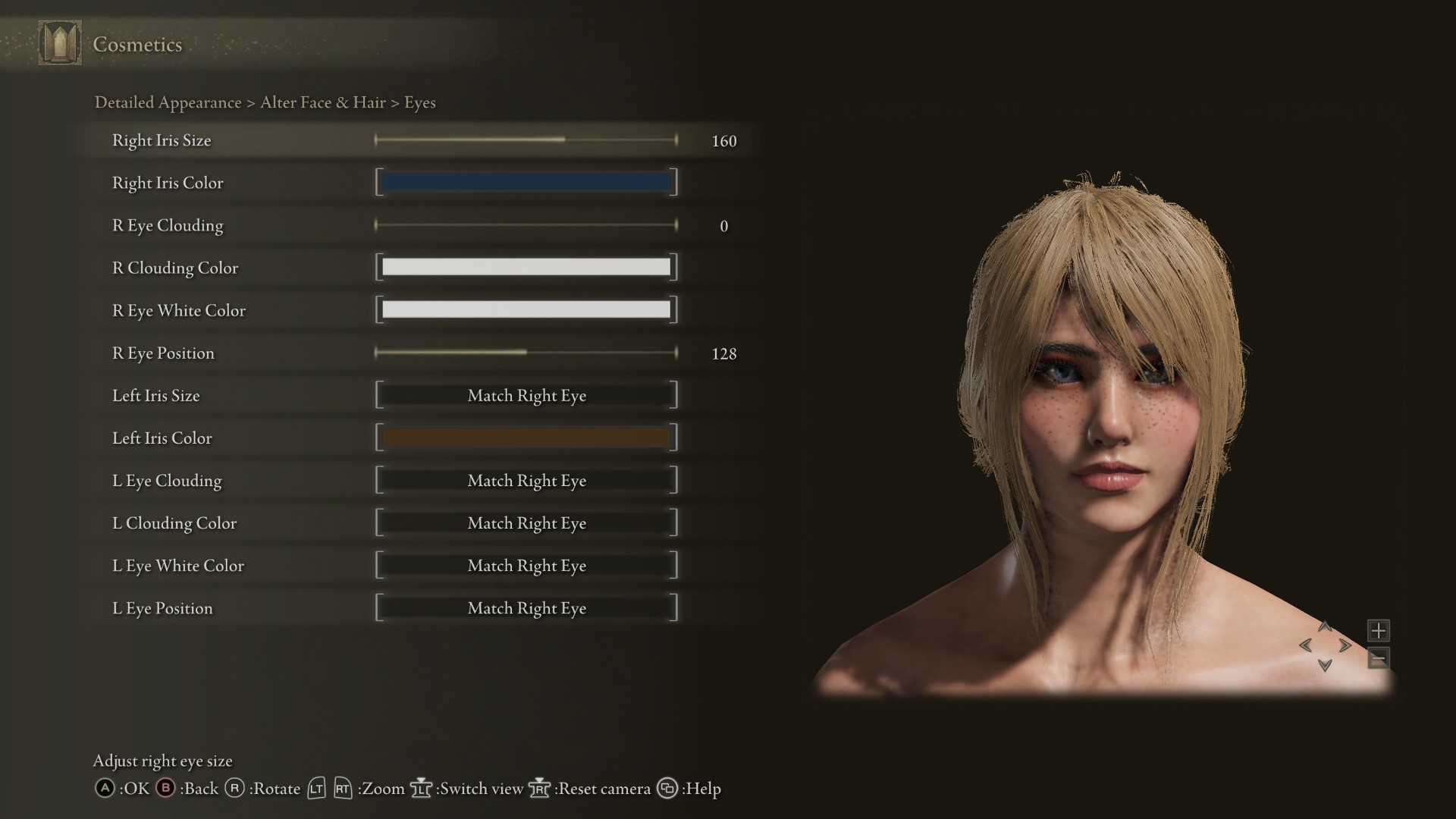
Finally customization settings should utilize sliders. For users with dyscalculia, number representations are hard to understand, especially when a game can go into negative and positive values for some settings. Using sliders that also update the content as they are used makes it easy to understand and you can still display a number value to the user if need be. See an example from Elden Ring’s customization below (taken from a Steam Community page):